Component-driven Software
http://codylindley.com/componentdrivensoftware/ by Cody Lindley
1 : Why Component-driven Software?
The following bullet points broadly explain why an organization might consider using a component-driven system and building component-driven software:
- Applications built from component tree architectures (e.g., Vue, React, Angular, etc.) can result in thousands of un-versioned built-as-needed undocumented and disorganized components resulting in monolithic front-end applications that are slow to build, have subpar UI's, have tightly coupled components, and are often difficult to maintain and scale. Ideally, what is needed is a system in which most if not all the components, especially UI components, become first-class citizens that are constructed in isolation, self-contained, versioned, and given the proper documentation and isolated testing routines.
- Front-end applications, as of late, are being developed by developers who are responsible for architecting the application, handling data retrieval, handling global state concerns, as well as constructing and testing all components within the application (including UI components). Front-end application developers carry too much workload when building user-centered, maintainable, cross-device, cross-platform, front-end applications—this workload results in long, complicated development cycles. Application developers simply have too many responsibilities when it comes to building nontrivial applications. As a result, component management (especially UI components) can become a second-class citizen or afterthought to application developers. Ideally, the burden of application development needs to be distributed to UI developers who are focused on building, testing, and maintaining UI components in a walled-off garden while application developers can simultaneously be working on application concerns.
- Organizations all too often fail to set up the proper systems and owners around design practices and development practices that facilitate sophisticated abstractions and correctly scoped reusable materials. Ideally, organizations should erect "Design System(s)" that fuel a "Component-driven System" that fuels application development. These solutions require appropriately skilled owners that play a particular role within an organization's design and engineering practices.
- Organizations who are looking to separate their design system from implementations (e.g., Adobe Spectrum is a design system, Adobe React Spectrum is an implementation).
- Organizations have realized or felt the empty promises of top-down components and seek a solution to build applications with bottom-up domain (complex) and primitive (simple) components instead of premature generic components that have too wide of a purpose and API surfaces due to crosscutting concerns.
- Organizations know the value of back-end micro services and micro front-ends that separate applications into multiple isolated applications, forming one application, and want continue this trend by breaking an application into isolated independent components.
2 : Component-driven Software Tenants
There is no one way to go about doing component-driven software or constructing a component-driven system. No two organizations are exactly alike, and as such, no two organizations will solve the same problems in the same way. Thus, no two organizations will erect the same component-driven system. This makes prescribing any single canonical component-driven system complicated. However, there are some foundational tenets of building component-driven software which component-driven systems will commonly embody.
Common tenets of a component-driven system are:
- Components get developed in isolation, tested in isolation, and are independently versioned using semantic versioning.
- Components become individual packages and get distributed using a public or private module repository (e.g., npm) for installing and uninstalling versioned module packages.
- Component-driven systems are engineered so that components within the system can be consumed to create other richer components within the system (i.e., Domain UI components are composed of Primitive UI components or said another way, Primitive UI components can be gathered together in order to produce Domain UI components).
- Components are a separate concern from the concerns of application architecture and application development.
- Components will undergo isolated unit testing (e.g., Jest), visually testing (e.g., Percy), and functional testing (e.g., Cypress) before they are consumed into an application runtime. Applications then test the implementation of a component, not the component itself.
- UI components are extracted from feature specifications by designers (worse case developers) and specified separately as component specifications.
- Components are viewed as a game of composition. When components, especially bottom-up UI components, are view in this way application developers can build the bulk of an application from precisely pre-built, heavily documented, and pre-test UI components that have fallen out of traditional UI mockups/screens and business requirements.
Disregarding one of the tenets mentioned above will erode the value of a component-driven systems relatively quickly.
3 : Component-driven Systems
Component-driven software is built from a component-driven system. A component-driven system is a system instituted by an organization that defines and facilitates the goals, strategies-architectures, roles-processes-assets, and tools used by the organization to birth and nurture independently built components.
3.1 : Goals
Before adopting component-driven software practices, an organization should get all the stakeholders in alignment (i.e., Product, Design, Engineer) on the goals of adopting such a methodology. Start by prioritizing a list of goals and then make strategic & architectural decision's based on the list of goals.
What are your goals: Speed development? Fortify the quality of the user interface and the user experience? Reuse? Visual unification? Behavioral Unification? Experiential Unification? Separate application development from UI development? Avoid monolithic unmaintainable applications that have to be re-built too often?
3.2 : Strategies & Architectures
After an organization has a set of prioritized goals, it will then need to use these goals to decide upon a component strategy and architecture.
Answer the following questions: Do you need top-down components, bottom-up, or both? Will you build UI components and nonpresentational components? Will you build primitive UI components as well as domain UI components. How will you organize your component sets? By product/application? By device? By platform? By all three? Is a Design System required? How does the Design System fuel the components? Will the component sets need to be themeable?
3.3 : Roles & Processes & Assets
With a set of goals and a component strategy & architecture defined, the design and engineering groups will next have to determine a design and development process for building independent components.
Determine: How will components be defined? When will components be defined? How will updates to components be managed? How does this fit into your development process that exists today? Do component collections accept contributions? Who is responsible for defining components (designer, developers, both?). Who is responsible for building and documenting components (UI developers, application developers, both?). Who is responsible for maintaining the component specifications and component implementations? Will you build a focused team around components? Will the team have transient contributors or focused permanent full-time roles?
3.4 : Tools
The last part of a component-driven system will involve selecting a set of tools and then implementing the tools so that independent components can be built, maintained, and shared within an organization. These tools can be divided into three categories, "Design Tools," "Component Tools," and "Development Tools."
Design Tools:
Various design tools are available for specifying components and developing/managing design systems. I'd mention several options except that, in my opinion, Figma is the obvious choice for supporting component-driven systems. Here is why: Here is why:
- Figma files can be embedded into component-driven systems (e.g., using the Storybook Designs addon you can add Figma for display directly when storybook when viewing a component)
- Figma has inline commenting/feedback system.
- Figma allows more than one editor at a time, which facilitates real-time collaborations.
- Figma offers a rich set of features and plugins for authors of Design Systems.
- Figma is web-based.
Component Tools:
Components are typically constructed using React/Preact (e.g., React Spectrum ), Vue (e.g., Vuetify), Angular (e.g., Material Angular), Web Components (e.g., shoelace), or HTML & CSS (e.g., Spectrum CSS). Depending upon which tool you use, each comes with a vast ecosystem of sub-tools, communities, and plugins.
Development Tools:
Two distinct tooling paths are available today that aid developers when developing independent components.
The first path entails using a tailored conglomeration of distinctly different tools that, as a whole, will provide the means to create and distribute independent components using a monorepo.
A basic tailored conglomeration of tools would be:
The second path would be to use an off-the-shelf, all-in-one tool constructed precisely for building component-driven software. Bit (specifically Bit Harmony) is currently the only product offering in this space that does most of what option one offers but with enterprise features. I like to think of Bit as a node app that can replace the majority of the tools from the previous path mentioned but with the added bonus of Bit.dev. Bit.dev is where Bit components can be publicly or privately hosted, shared, and composed. Consider Bit.dev like a global Storybook in the cloud where anyone can place a collection of runnable components that are aware of all other collections of components within the cloud.
Below are some bullet points articulating what Bit does really well v.s. curating a conglomerated system of separate tools.
- Bit will version not just every release of the component itself (i.e. an npm sermver) but also the historical artifacts that support the component (e.g., source code, builds, compositions, logs, docs, etc...). In a sense, Bit Harmony is a content versioning system for independent components. Bit manages development history, and it allows you to go back in time and review previous versions of the component package.
- Bit conceals the complexities of Yarn workspaces, Lerna, Babel, npm, and build tools.
- Bit offers Bit.dev, a place to immediately host, share, and collaborate on components.
- Bit works with presentational components as well as non-presentational components. In other words, it does not assume you only want to build UI components.
- Bit handles the dependencies for independent components.
- Bit, if fully adopted (i.e., bit.dev workspaces) can also continuously release a component to anyone who consumes/composes it via Bit.dev
4 : LocusLabs Use Case
4.1 : Overview
In March 2020, I was hired by the CTO and VP of Product from LocusLabs to orchestrate a component-driven software practice with the design lead. What is described below is the component-driven system we built for Locuslabs.
Note:
- As you read this use case, keep in mind that the decisions for the system were unique to LocusLabs. Note that LocusLabs built several different types of applications running on various devices (Kiosks, Large Displays, Desktops & Laptops, Tablets, and Mobile phones) used or viewed by various types of users (i.e. stationary users viewing only, walking users viewing only, kiosk touch users, desktop/laptop mouse users, mobile phone touch users).
- The system built for Locuslabs is not a general prescription for other organizations. Use this use case as an example of the scope and practice of creating component-driven systems.
4.2 : Goals
The leadership from product, design, and engineering agreed on the following component-driven goals:
- Produce as much of the UI as possible for any given product/application in conjunction with design in the form of UI components so application developers can focus on application development and not UI development.
- Have unchangeable UI integrity (i.e. cemented visual design, behavioral design, interaction design) baked into the components before they are implemented.
- Speed the development and UI quality of products/applications by creating a new engineering group that focused on the development and testing of UI components that had been specified in detail by the design team using component specifications.
4.3 : Strategies & Architectures
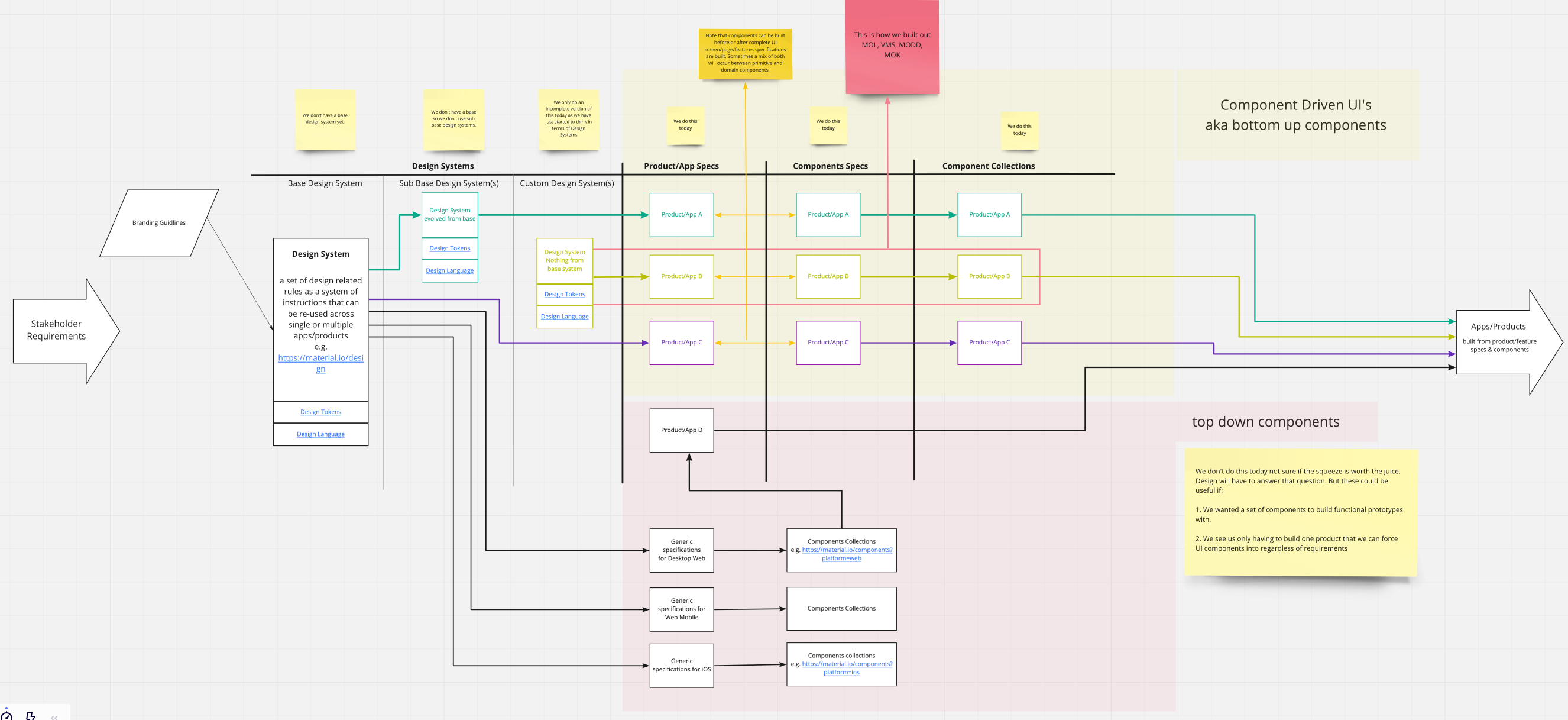
The following strategies and component architecture were agreed upon by all parties involved so that the component-driven goals could be achieved:
- Build bottom-up stateless React UI components for each product/application (individually versioned and packaged).
- Each product/application would use its own design system.
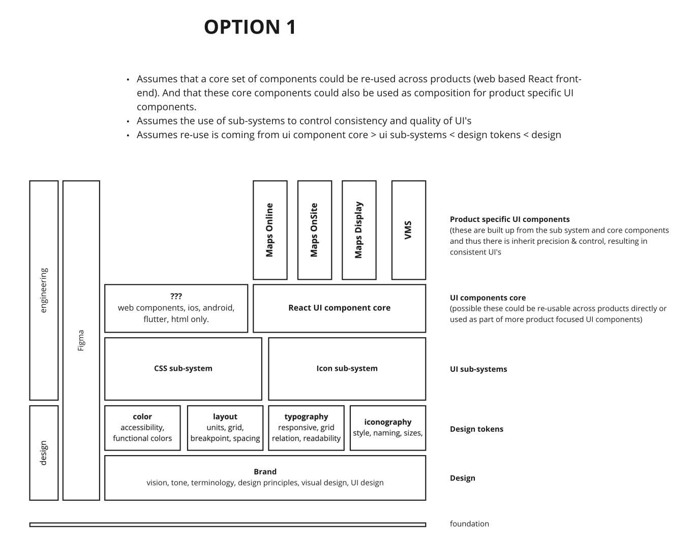
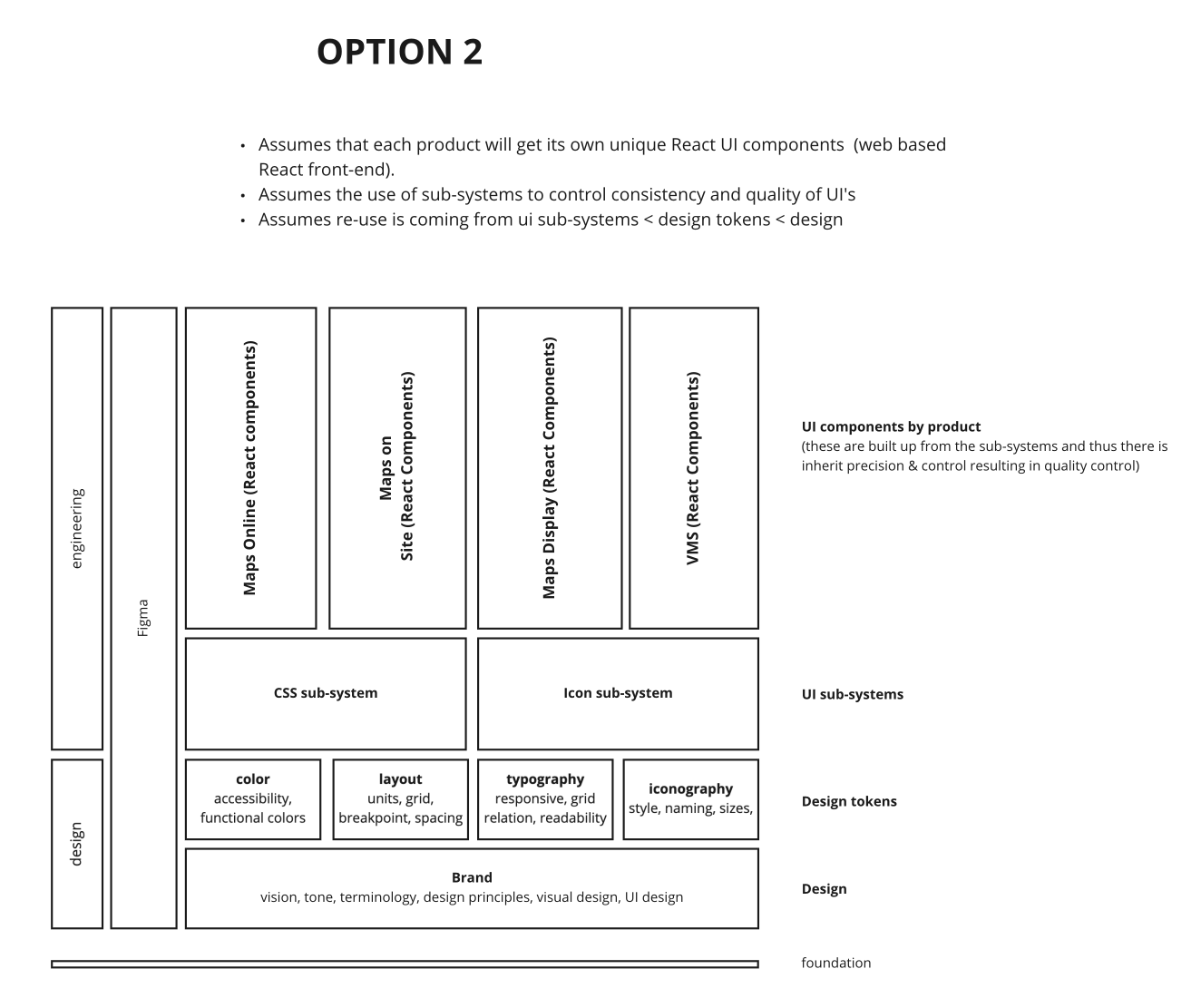
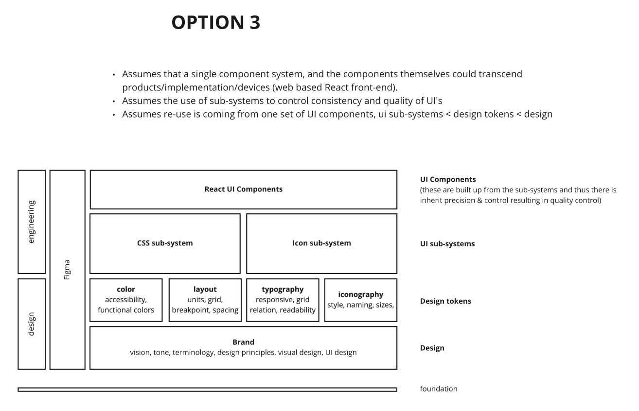
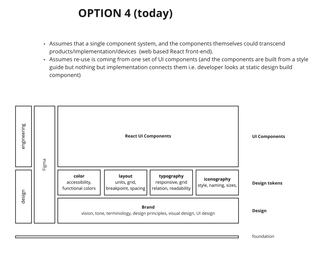
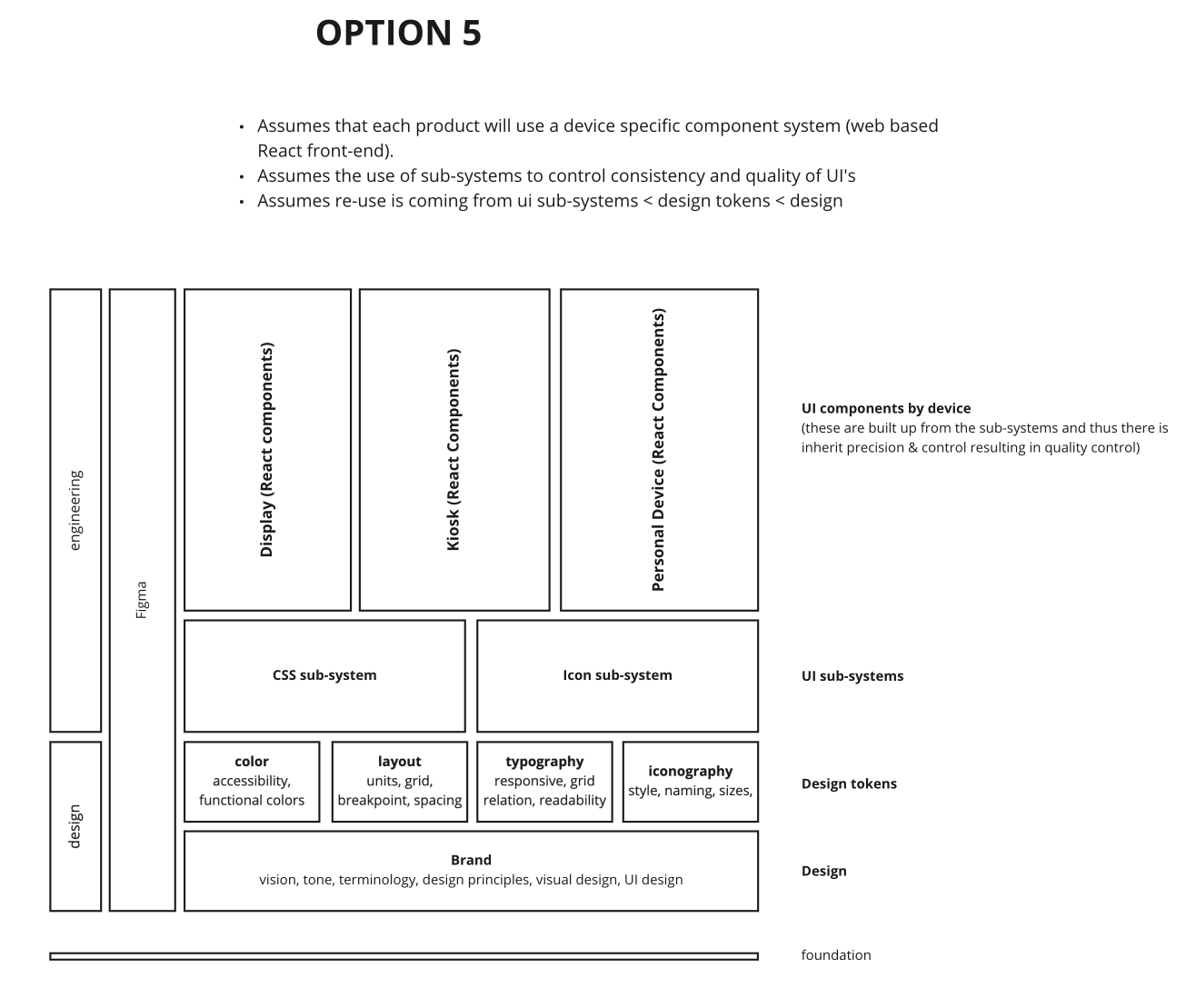
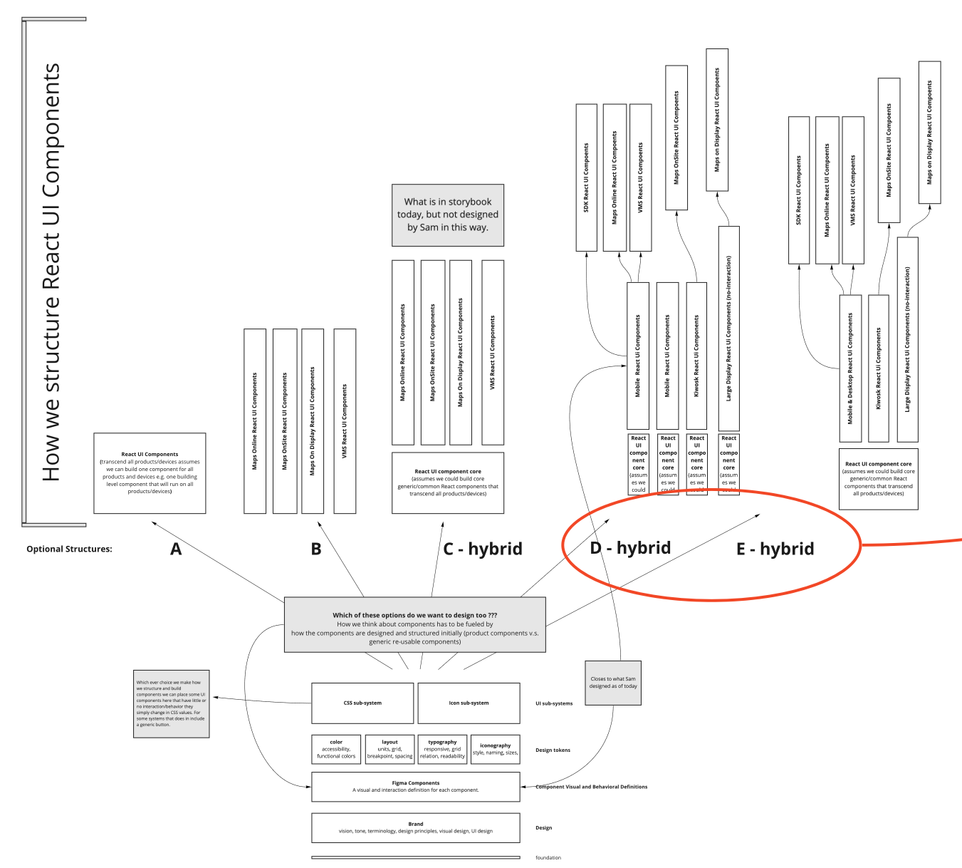
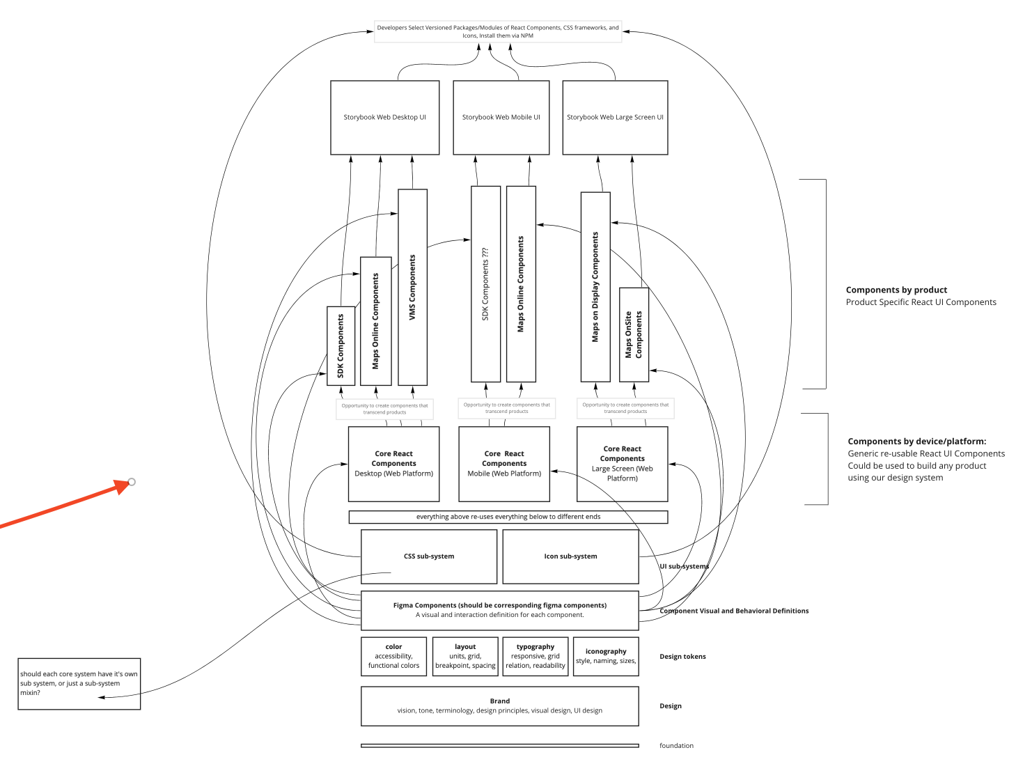
- The component collections will be organized by product > device (optional) > composability (primitive v.s. domain).
- Component re-use only occurs internally within each product/application. In no way did products/applications share components externally. The cost to repeat oneself was trivial compared to the risks of any type of top-down components tightly coupling products together or complicating component development and design.
- Each component set will use a component theme (also an independent component) that can be overridden (i.e. customizable design tokens from the design system).
An example collection of components for a product called "Maps Online" would be:
- Maps Online Desktop/Tablet Components:
- domain
- componentA
- componentB
- etc
- primitive
- componentA
- componentB
- etc
- domain
- Maps Online Mobile Components:
- domain
- componentA
- componentB
- etc
- primitive
- componentA
- componentB
- etc
- domain
Laboring an agreed upon strategy and architecture was not an easy feat. It took weeks of conversations and focusing on the goals to arrive at an agreed upon idea of what to build and how to build it.
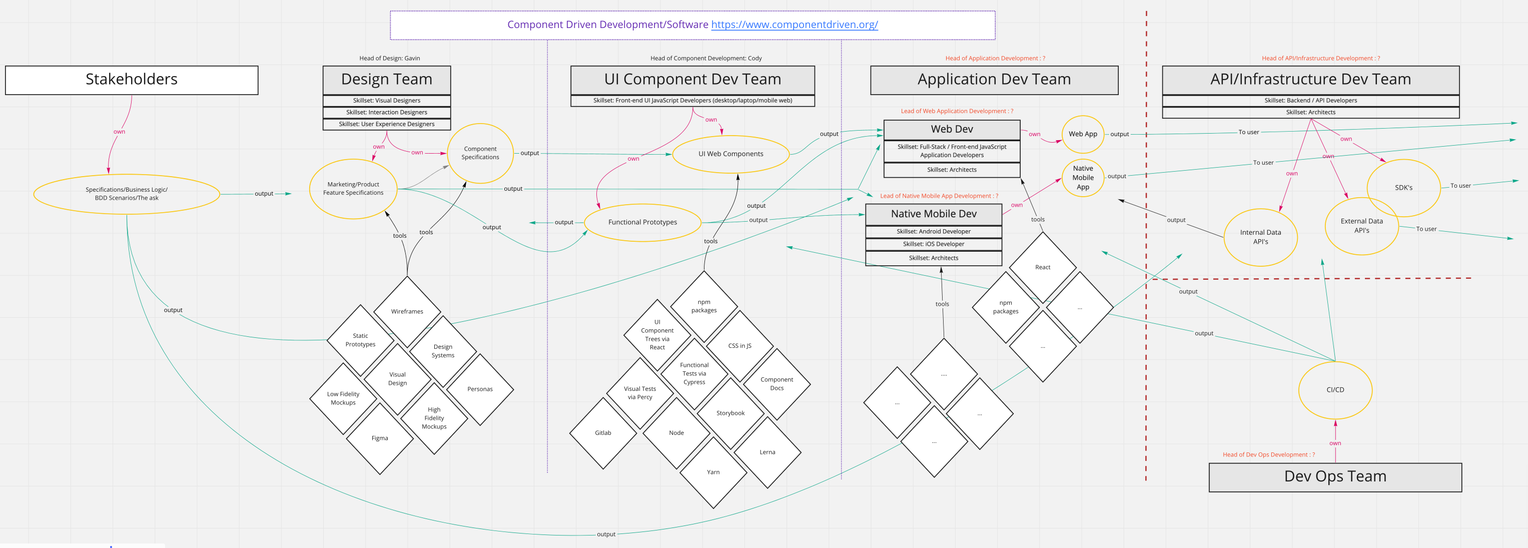
Below are a few of the diagrams that were used when discussing and settling on the correct component strategy and architecture:
4.4 : Roles & Processes & Assets
A new engineering group was formed within the LocusLabs made up of two full-time front-end UI engineers and one front-end UI engineer lead. The team was called the "UI Component Dev Team". The lead worked with designs from the design team to build out a component-driven process and a component specification template that would produce a collection of bottom-up components for each product.
The process:
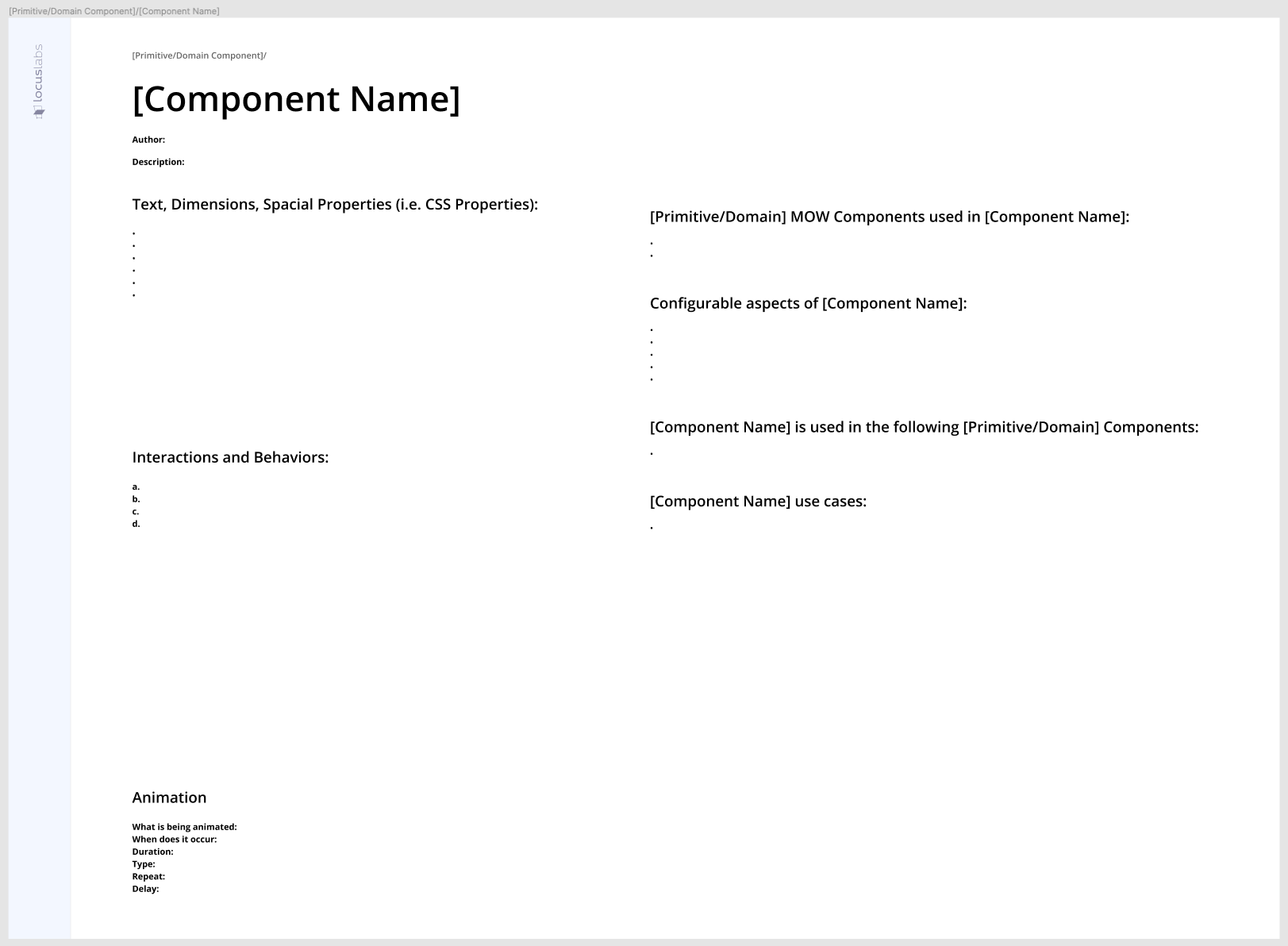
The component specification template:
The component development process worked as follows. Each product/application would be built out according to the business/product requirements using standard screen mockups which visually defined the features of the product/application.
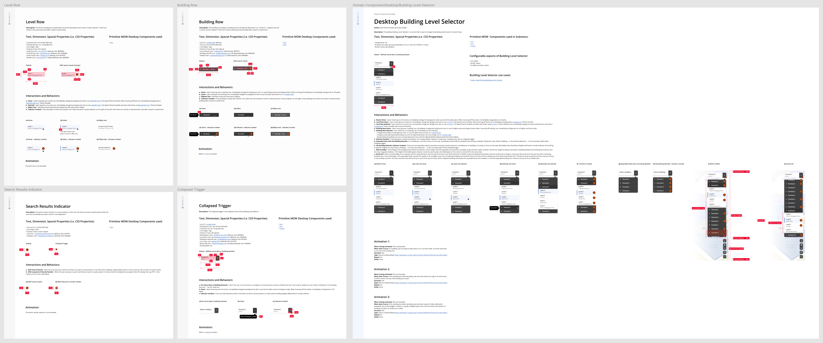
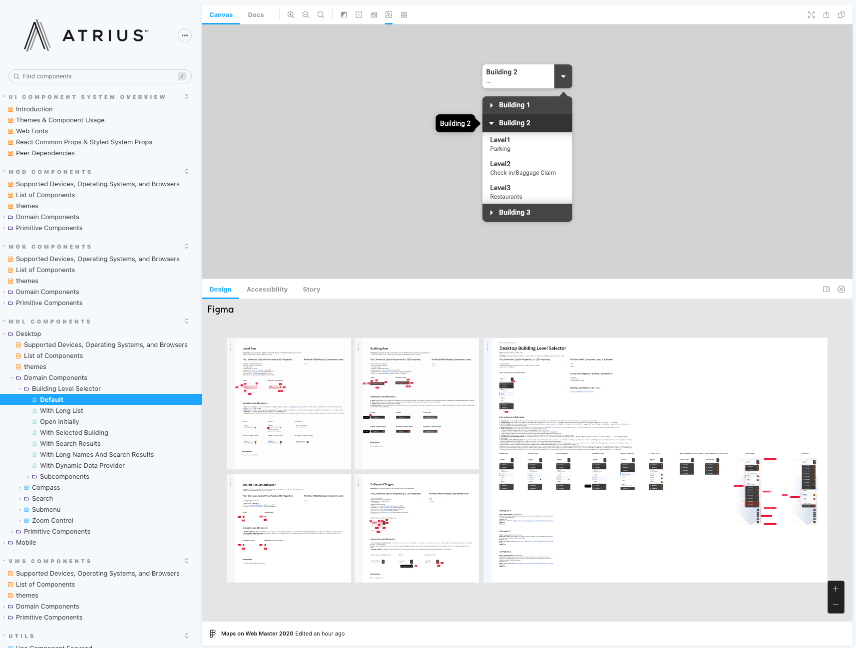
For example, below is part of the feature specification representing the building level selector feature in the Maps Online product (i.e. a high fidelity screen mockup):
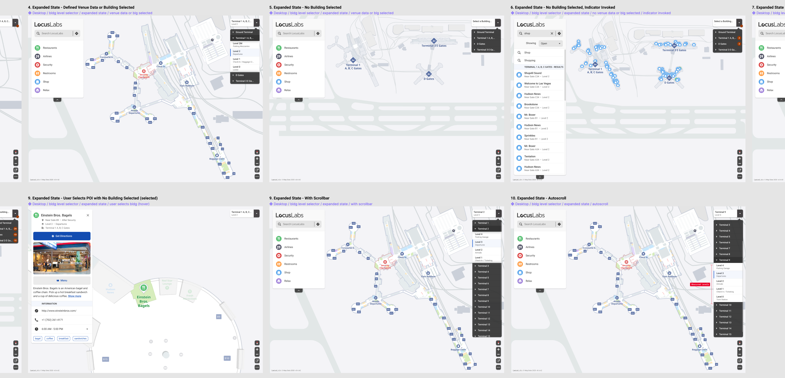
After feature specifications were completed for an entire product/application the design team would componentize the mockups into components (with the help of the component dev team) and then specify each component outside of the feature specifications (i.e. letting the component specifications fall out of the feature specifications).
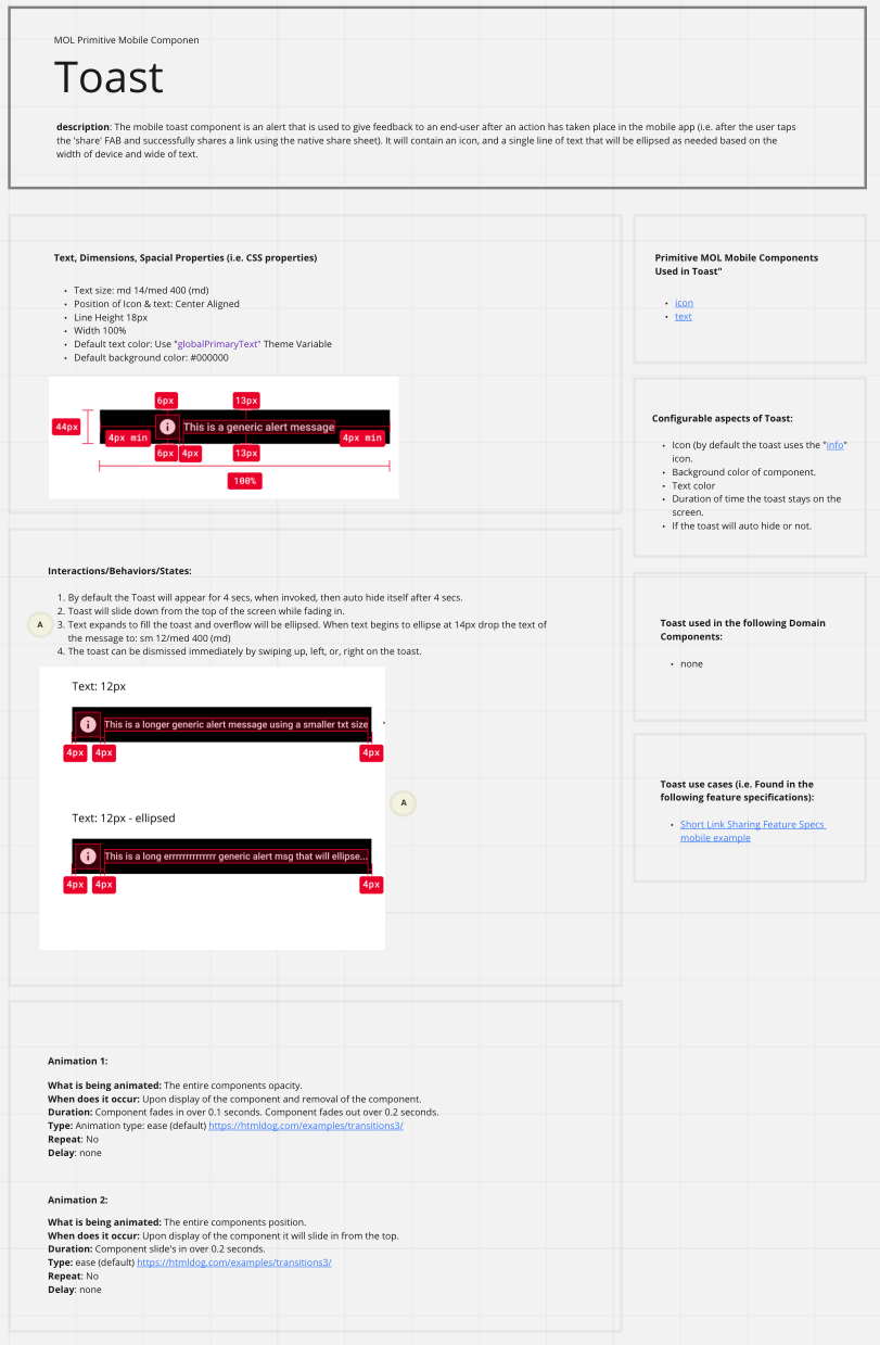
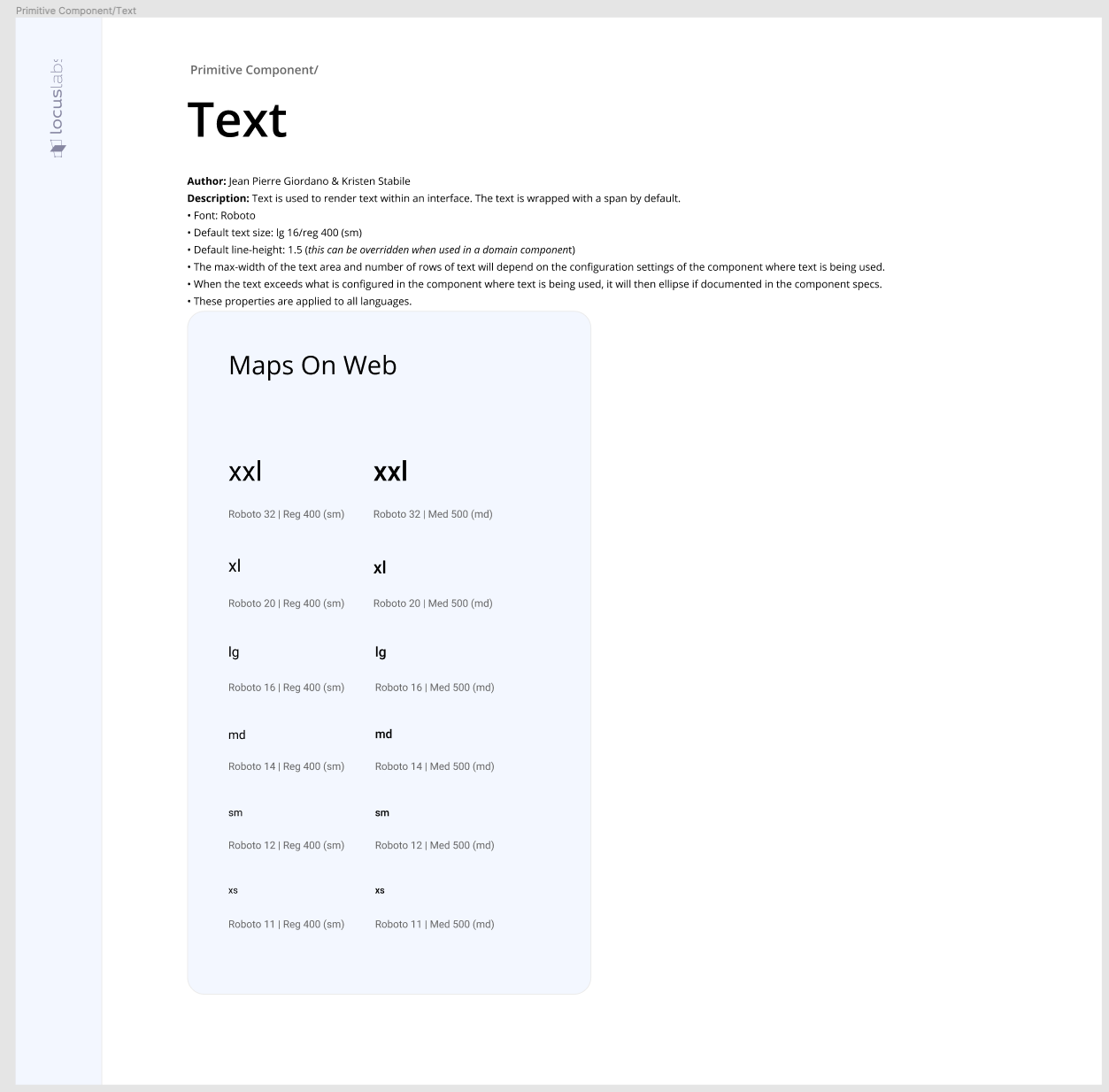
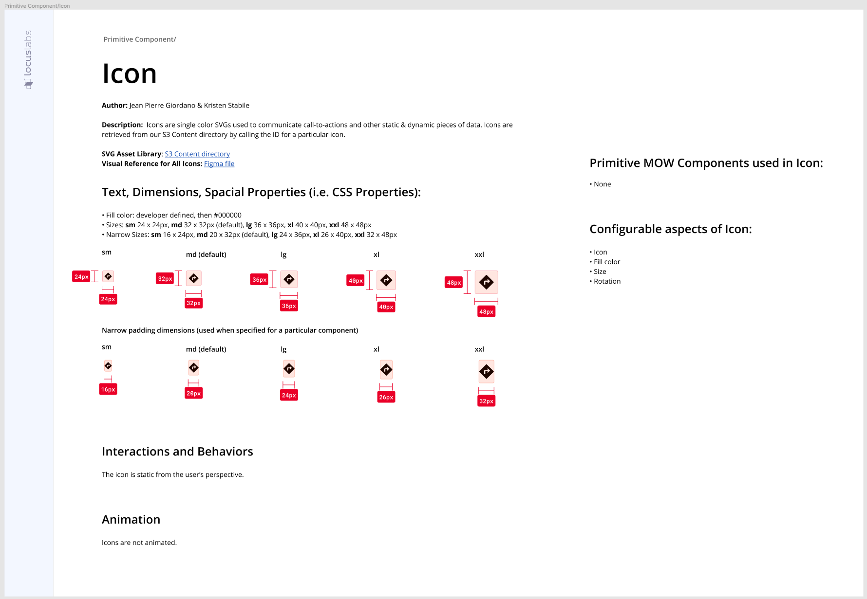
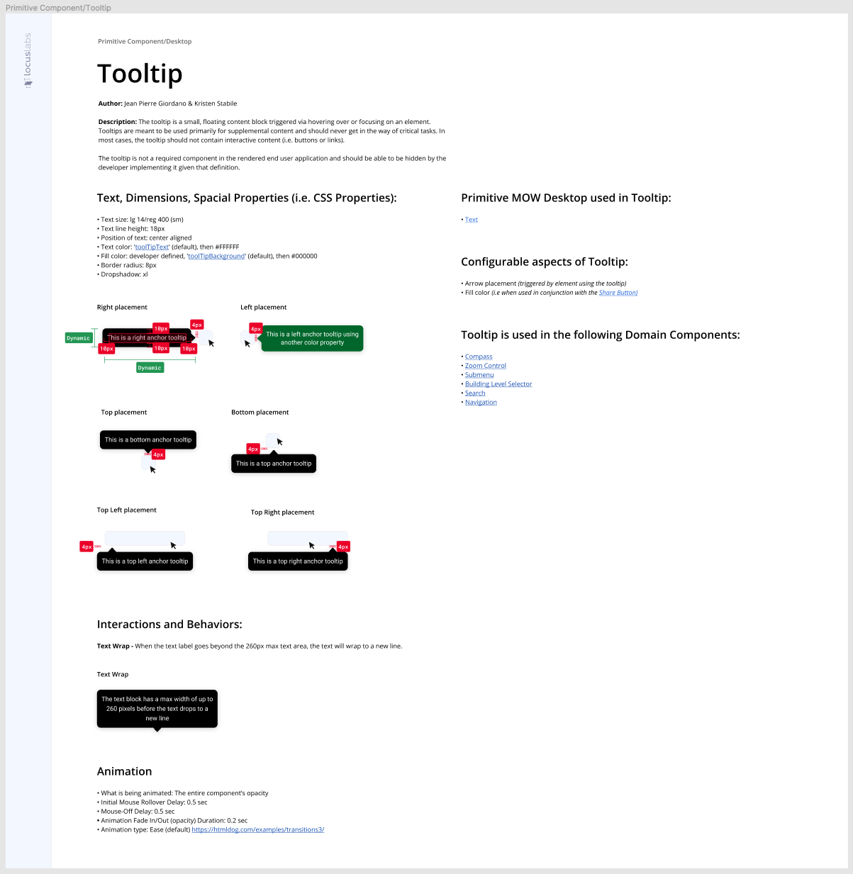
For example, below is the building level selector domain components specification as well as the primitive component specs that helped composed the building level selector domain component:
Note:
- Component specifications could also define their own internal sub-components that we called component facets. Facets are components that required individual specifications, in order to stay organized, but were not intended for use by an application engineer, only a component developer. For example, in the building level selector component specification above the four internal components were specified as internal components (i.e. Level Row, Building Row, Search Results Indicator, Collapsed Tripper).
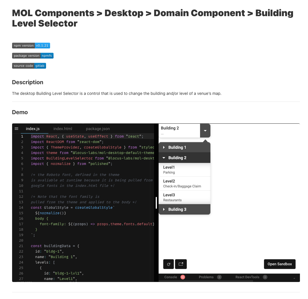
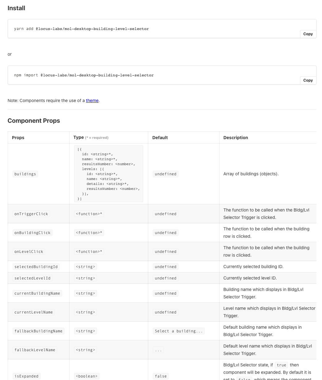
Once component specifications had been indicated as complete by the designers the engineers from the UI component dev team would take the specifications and build out the components and create the automated visual and functional test for each component using the tools decided upon by the teams lead UI engineer:
For example here is the built domain building level selector component inside of Storybook:
When a component was released as an npm package it became consumable by application developers. When enough of the components were design complete and built the application developers would then take the feature specifications and components and build component driven software.
4.5 : Tools
Briefly, components were developed, documented, and shared using Storybook from a monorepo (i.e. yarn workspaces) that housed all the npm component packages. Component stories within storybook were considered test cases for the components interface (i.e., React props) and "tests cases" were verified using Percy and Cypress storybook plugins via Gitlabs CI/CD automation tools (e.g., visual testing and functional testing on every commit to a development branch in Git).
Components were individually distributed to application developers from the npm registry with the help of Lerna. Once a component was available from the npm registry the documentation pages for each component would verify the components basic usage via codesandbox demo (also used an automated cypress test, to test all the codesandbox demos).
Make no mistake about it orchestrating a set of standalone tools to manage collections of independently version components as well as defining how components are built, documented, and tested is no trivial matter. For a better understanding of the implications you can review the monorepo for the LocusLabs components.
Below are a list of the tools that were used to orchestrate the development, management, testing, and distribution of LocusLabs UI components:
Design System, Feature Specifications, Component Specifications
CI/CD
- Gitlab
Component Delivery
Development
UI Components
Documentation & Demos
Testing & Quality
Prior Art
Canonical example of a Design System and its implementations
Design System: Spectrum
Implementations: Spectrum CSS, React Spectrum, React Aria, React Stately
Examples of top-down generic component collections
Use the examples below as model on which to construct your own set of bottom-up components specific to your product or application.
Examples of bottom-up component collections
Articles
- Component Driven User Interfaces & Component-Driven Development
- Component-Driven
- Atomic Design
- Building Micro Frontends with Components
- Independent Components: The Web’s New Building Blocks
- Bit Harmony: A New Tool To Create and Collaborate on Independent Node.js Components
Talks
Terms
Application Runtime
When the source code for an application is executed and the application is running (e.g., if you use React then the runtime is when the web platform takes source code and runs it to produce a running application in a web browser).
Bottom-up Components
A collection of custom-built components the when implemented, are intended to construct a known and already specified set of feature specifications within a product/application. Implementing and adopting these components is trivial because components are constructed specifically for a product or application from the design team (typically using a design system). Think of bottom-up components as the result of breaking down a product or application into primitive and domain components that have been precisely designed for the product or application.
Component
"A component is any group of files that serve a single purpose. That can be a React component, a Vue component, a Node.JS module, a CSS component, etc. Each of these can be of different levels of complexity and concreteness. For example, a component can be a full page or a simple UI element. It can be a small utility function or an entire microservice." - from "Independent Components: The Web’s New Building Blocks"
Component-driven software
Catch-all term used to describe the methodologies and tools for subdividing part or all of an application into composable independently specified and managed presentational (i.e., UI components) and nonpresentational composable components. The components are built, versioned, and tested separately from application development concerns and design concerns to ensure quality and avoid monolithic software applications.
Component-driven system
A systematic plan instituted by an organization made up of the goals, strategies-architectures, roles-processes-assets, and tools leveraged by an organization in order to birth and nurture components for component-driven software applications.
Component Integration
When application developers take an external component and intergrade it into the source code for a given application. Typically, application developers will install a component then use the component.
Component Specifications
Refers to a specification created by designers explicitly scoped to the details of a component alone. Component specifications typically fall out of feature specifications.
Design System
A set of reusable design-related rules (tokens, patterns, behaviors, language) as a system of instructions that can fuel various implementations. Design systems are the fuel used to create component implementations.
Domain UI/Presentational Components
A component, typically constructed for a specific application or product that does not have any obvious UI reuse but exists to provide application developers with more than just simplistic and generic reusable components (i.e., a unique view or specific "organism/molecule" to borrow from Atomic Design). These components are often complex and take up a lot of the user's attention and view within a user interface (e.g., an entire header or footer or a complex domain-specific search UI).
Feature Specifications
Refers to the specifications created by designers to communicate the features of an entire application. Feature Specifications typically come in the form of high fidelity or low fidelity page or screen mockups with annotations describing the user experience and or interaction designs intended by the designers.
Mirco Frontends
An application architecture that results in a single application constructed from more than one application runtime (be it an iframe or a module that represents an application)
Non-UI Component (aka non-presentational component)
A component that has no user facing surface to it. In other words, the component has no user interface aspect.
Primitive UI/Presentational Components
A component built that priorities an innate reusable nature (e.g., buttons, Icons, Modals, etc.) rather than a specific domain use case (i.e., similar to "Atoms" from Atomic Design). Primitive components are often constructed to be consumed by domain components to create less general UI components.
Top-down Components
A collection of nonspecific optimistically produced components with generic cross-cutting features typically valued on the promise of UI unification and reuse. Think of top-down components as components that are not built with any specific product or application in mind but as off-the-shelf generic solutions to common UI patterns (e.g., a generic modal component). Few organizations can benefit or maintain a set of top-down components while creating custom user-centered UI's. No one component can account for all current and future use cases within custom UI's. Top-down component systems often fail because they are leveraged in situations that most often require bottom-up components. Top-down components do have a use case, but they are usually for prototyping, non-critical UI's, generically patterned UI's, or as plumbing to bottom-up components in the form of headless or unstyled UI parts (e.g., reakit.io, readix-ui.com, headlessui.dev).
UI Component (aka presentational component)
A component that has with it a user facing surface (e.g., a button component) to one degree or another even that surface lacks dimension but otherwise dictates how something visual appears (e.g., a layout component).
FAQ
Can you just give me the TLTR
Component-driven software is software the is built from independently specified, built, versioned, documented, and tested components using a component-driven system.
Wait, are you asserting that each product/application would have its own unique collection of components?
Yes. This exactly the notion at the heart of component-driven software by way of a component-driven system. It is my belief that a general consensus is being reached among professionals in this space that the idea of a single generic top-down set of components as a system of reuse and visual normalization tool is mostly a failed endeavor with a limited use case. If you have only one product/application then yes created a single collection of components for the context. But, the notion that a generic top-down collection of components can be used to build out multiple applications/products today and in the future is a flawed idea in practice. It almost always fails unless what you really require in the finished product is a general and generic application built from general and generic design patterns.
Isn't this just window dressing around the idea of leveraging generic UI Toolkits?
If your organization has the luxury (few do) of building software from a slightly customizable off-the-shelf generic UI toolkit (be internally built or from a thirdparty), then you have already surrendered the UI to a generalized set of top-down components that come with pre-determined locked features, behaviors, and interactions.
Suppose it is determined that an application will be built with something like Material-UI components; this decision in many ways determines the features of the application that can be used to solve UI problems. They have forced the hands of the designers as well as the application developers because by adopting pre-built components, they have restricted the UI to a broad set of UI design solutions (i.e. Pre-built UI components have baked into them generalized solutions to common UI patterns). Using pre-built components as-is affects how UI's can be built to solve user interface problems in a user-centered-minded manner.
Does this mean that all components in a component-driven system are custom built from the ground up. No! However, it does mean that if you are borrowing something from a third-party, then you should wrap it up in a custom component so that the details of the implementation are abstracted.
Component-driven software and the system devised to support the tenets of component-driven software are typically instituted within an organization when the organization recognizes that bottom-up components are needed to construct custom user-centered UI's for individual applications that may run across various platforms and devices using one or more design systems.
Where/when does a "Design System" come into play?
I define a design system as "a set of reusable design-related rules (tokens, patterns, behaviors, language) as a system of instructions that can fuel various types of implementations that can or cannot be component driven."
Design Systems are used by designers and interaction designers and come before implementations. UI components and theme components consume a Design System.
Don't conflate a design system with an implementation fueled by a Design system. Design systems end where implementations and component-driven systems begin.
Is this just another name for a "Micro Frontend"?
I define a "Micro Frontend" to mean, "An application architecture that results in a single application constructed from more than one application runtime (be it an iframe or a module that represents an application running in the same frame)."
The terms "component-driven" and "Micro Frontends" are often conflated. Don't confuse these two terms because subdividing software into components and subdividing software (including the UI) into separate runtimes/apps might share the nature of subdividing a thing but the concepts have very different purposes, costs, and returns. A micro frontend architecture can use components from a component-driven system just like any non-micro frontend architecture.
Is this just Atomic Design applied to applications made from component trees?
Atomic design is a semantic useful for drawing boundaries around UI's when creating style guides. This concept is somewhat of a deprecated practice given the advancements of Design Systems. In a modern sense the value of the semantics provided by Atomic Design devolves quickly because overly categorizing components induces mental model complexities and confusion when building composable components.
For this reason, when thinking in terms of UI components, I have found it easier to think in terms of primitive UI components v.s. domain UI components. To briefly borrow and simplify Atomic Design semantics the only line of demarcating needed is a component is either an "Atom" or something more than an Atom. Said another way a component is built with the nature of composition as a first-order priority (i.e, primitive like a button) or not (i.e. domain like a specific header in an app that may or may not contain primitive components).
In many ways, a proper Design System has replaced the need to think in terms of Atomic Design. A Design System properly fueling a component-driven system (via component specifications) should be all that is needed today. But make no mistake about it, Atomic Design semantics paved the way for Design Systems and Component-Driven Software.